Capsule Closet Stylist Guide

Personal Colour Analysis Guide

Palette Category: Pure One Cool Key Features: Cool Pink Undertones & Striking Eyes Target: High Contrast & Vibrant Accent Layering

About The Pure One Cool Profile

You sit in the Pure Colouring category with pale skin built on cool, pink-based undertones. Your hair ranges from dark brown to black with matching eyebrows and eyelashes, creating a striking contrast with bright green, blue, or aqua eyes that serve as your most noticeable feature.

Primary Palette Objective: Frame the face with deep, clear, or bright shades that reflect vitality into your skin, balancing your dark hair and skin tone ratio while avoiding dull, flat monochrome combinations.

✦ Canvas & Paint Layering Strategy

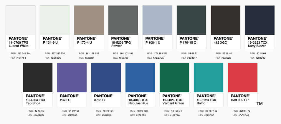
Build your core wardrobe using foundational Canvas Colours like Navy, Coal, Steel, Coffee, and Pure White. Inject personality and pop using vibrant Paint Colours like Emerald, Cobalt, Cherry, Bubblegum, and Deep Violet. Always place deep or bright tones nearest your face to illuminate your complexion and enhance eye clarity.

Palette Architecture & Selection

Clothing & Tones Recommended
  • Face-Framing Brights: Deep and vivid shades placed directly near the neck and face.
  • High-Contrast Pairing: Coal or Navy combined with Lucent White, Ice, or bright accent shades.
  • Vibrant Block Colours: Choosing deep, rich jewel tones when wearing solid block items.
  • Bright Accessories: Statement scarves, jewellery, or bags to elevate neutral outfits.
  • Sparkle & Metallic Finish: Silver and clear shine to brighten plain or dark ensembles.
Tones & Combinations to Avoid
  • Head-to-toe muted shades like plain taupe, stone, or khaki without bright accents.
  • All-pastel summer outfits that lack contrasting depth or vibrant accessories.
  • Flat, monochrome dark outfits in winter without pops of clear colour.
  • Dusty, washed-out tones placed directly underneath the chin.
Workwear & Official Styling
  • Base Staples: Tailored pieces in Coal, Navy, or Deep Coffee.
  • Crisp Contrast Layering: Navy or Coal jackets paired with Saltwater Slide, Ice, or White tops.
  • Refined Accents: Silk scarves or subtle jewellery in Royal Purple or Nebulas Blue.
Seasonal Styling Mistakes
  • Wearing completely light pastels during summer without adding bright accessories.
  • Sinking into completely muted, heavy dark tones throughout winter.
  • Mixing overly warm, yellow-based earth tones against cool pink skin undertones.
Canvas Base Shades
  • Pure White, Bone, Taupe, Murky Sea, Silver
  • Steel, Coffee, Navy, Coal, Royal Purple
Paint & Accent Shades
  • Cobalt, Royal, Emerald, Turquoise, Strawberry, Cherry, Raspberry, Lime
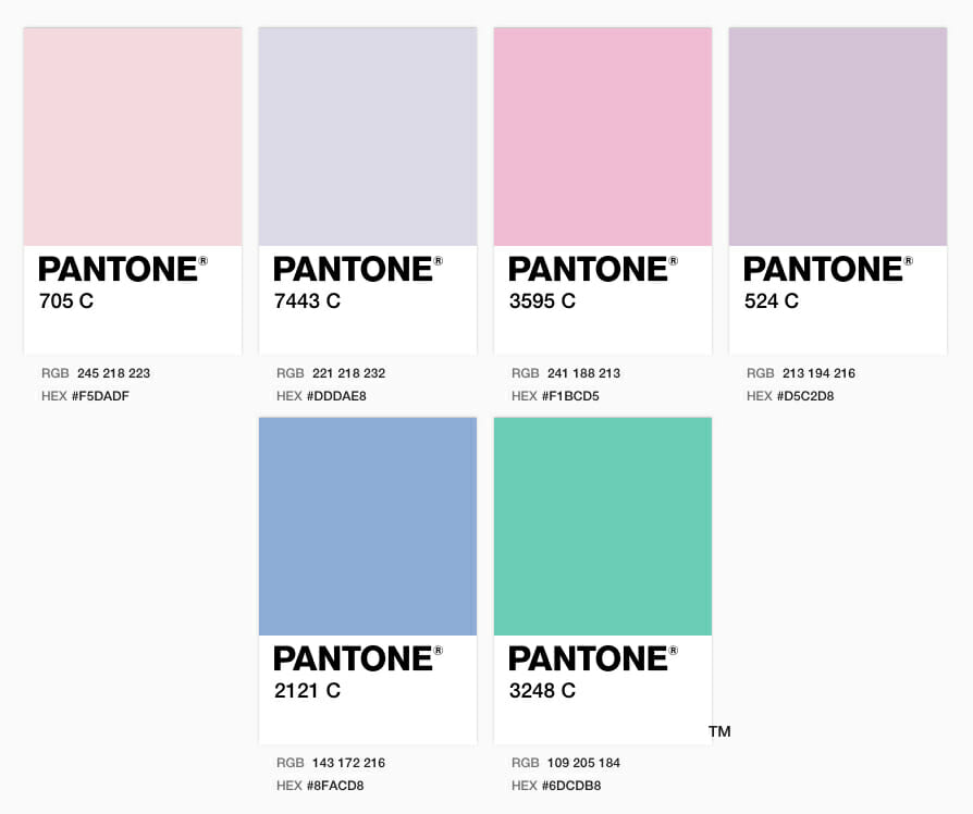
  • Ice, Lemon, Winter, Peach, Bubblegum, Sea Glass, Algie, Ocean, Sky, Deep Violet, Aqua, Berry Icecream, Fruit Smoothie, Mint, Forest

Curated Palette Outfits

Casual Daywear
  • Base: Navy or Dark Denim wide-leg trousers.
  • Top: Ice blue or Pure White jersey tee.
  • Layer/Accent: Raspberry or Cherry knit cardigan worn open.
  • Details: Silver jewellery or bright contrast tote bag.
Tailored Professional
  • Suiting: Coal black or Navy tailored blazer and pant set.
  • Inner Top: Crisp Pure White or Saltwater Slide blouse.
  • Accents: Deep Violet or Emerald silk pocket square/scarf.
  • Footwear: Sleek dark leather pumps.
Evening & Special Events
  • Dress: Royal Purple or Cobalt blue dress.
  • Outerwear: Steel grey or Silver structured evening coat.
  • Accessories: Sparkly silver jewellery and bold lip colour in Cherry or Berry.
  • Footwear: High-contrast statement heels.

Colour Mistakes to Avoid

Mistake 1 Washing Out Skin with Unassisted Muted Shades

Wearing stone, taupe, or khaki without contrast draws warmth out of cool skin and makes your complexion appear grey. Better choice: Always mix muted canvas pieces with bright tones like Cobalt, Lime, or Emerald.

Mistake 2 Dulling Eye Impact with Soft, Pale Colours

Placing pale or muted colors directly against the face drains the striking clarity of blue, green, or aqua eyes. Better choice: Keep bright or deep tones closest to your neckline.

Mistake 3 Forgetting Contrast in Seasonal Wardrobes

Sinking into all-dark winter coats or all-pastel summer dresses flattens your high-contrast hair-to-skin ratio. Better choice: Add bright scarves/accessories in summer and winter to maintain high contrast.

Core Directives for Pure One Cool

1. Test Garments Against Your Face

Always hold fabrics up to your face in natural light. A complimentary bright tone will instantly clarify your complexion, whereas an incorrect muted tone will wash you out.

2. Maintain High Contrast Ratios

Echo your natural dark hair and pale skin contrast by pairing dark canvas staples with light or vivid paint accents.

3. Use Canvas for Investment, Paint for Accent

Allocate 70% of your wardrobe to high-quality Canvas neutrals (Navy, Coal, Pure White, Steel) and 30% to vibrant Paint accents (Emerald, Cherry, Royal, Turquoise).

```

Pure One (Cool) Canvas Colours

Select colours from the list below to become the staple of your wardrobe.

Pure White
Bone
Taupe
Murky Sea
Silver
Steel
Coffee
Navy
Coal
Royal Purple
Colbalt
Royal
Emerald
Turquoise
Strawberry

Pure One (Cool) Paint Colours

Choose colours from the list below for your fun colours to highlight and enhance your outfits. 

Ice
Lemon
Winter
Peach
Bubblegum
Cherry
Raspberry
Lime
Sea Glass
Algie
Ocean
sky
Deep Violet
Summer
Aqua

Personal Pure One (Cool) Colours

These colours in particular suit the Pure One skin tone. Select these, alongside shades above for fun colours and those that will sit closest to your face. 

Sherbet
Ice Violet
Pink Sherbet
Lilac Powder
Sky Powder
Mint Cream